Back
ROCKETBOOK MINI'S FIRST USER EXPERIENCE
Usability testing to reveal where new users skip, hesitate, and get lost.
Timeline
8 Weeks|Spring 2025
Role
UX Researcher &
UX Designer
Team
Asha Awil
User Researcher
Isabella Chiavettone
User Researcher
Kurtis Reiner
User Researcher
Mitchell Tran
User Researcher
Lahari Sri T
User Researcher


Advisor
Dr Anthony Andre
Skills
Research Planning
Study Design
Usability Testing
Data Collection
Analysis

OVERVIEW
The Rocketbook Mini was advertised as an easy way to capture notes and upload them to the cloud; however, first-time users faced difficulties with finding their scans, accessing support, and erasing notes.
When we asked first-time users to spend 40 minutes with the Rocketbook Mini and its companion app, we weren’t trying to test their intelligence. We were testing the product’s ability to guide them. These were tech-comfortable participants, the kind who breeze through new apps without manuals. But here, something unexpected happened: hesitation, detours, and moments of “Wait… did that work?”

Participant writing, scanning, and digitizing notes.
Key Insight
Missing usability supports created a 'Trust Gap.'
The product successfully digitized notes, but failed to communicate success to the user. This lack of system status visibility led users to believe they had failed, even when they succeeded.
METHODOLOGY
Testing the "First Hour" Experience.

Personnel and Roles
This was part of my graduate UX research course (SJSU ISE-215), where I designed and facilitated a usability study from scratch.
We didn't test expert users. Instead, we recruited 5 tech-savvy novices and gave them the Rocketbook Mini for the first time. We observed their natural behavior during the critical first 40 minutes of onboarding to see where the intuitive design ended, and the confusion began.
The goal?
Observe novice users’ very first interactions, capture where the flow broke down, and translate those findings into actionable design recommendations.
PARTICIPANTS
5
First-time Rocketbook users, all tech-comfortable but unfamiliar with the product.
TASKS
6 Realistic Scenarios
from writing a note,
to logging into the account
to scan it using the app,
sending it to the cloud
to explore extra features,
and finally, erasing the page.
DATA CAPTURED
Task times,
success rates,
error counts,
observed behaviors,
and self-reported ease /satisfaction on a 7-point scale.
FINDINGS - THE EARLY DROP OFFS
Users skipped onboarding, hesitated after scanning, and couldn’t find help
It didn’t take long for patterns to emerge….
Key Performance Breakdown
4 of 5
skipped the onboarding tutorial entirely. None revisited it during free play.
1 of 5
found the Help Center unassisted, while others tapped unrelated tabs before giving up.
3 of 5
hesitated mid-scan, unsure whether their note had been sent.
2x
time to erase a page for novices due to uncertainty about pen type and erasing method.
From the data and observations, here’s what became clear
Subjective
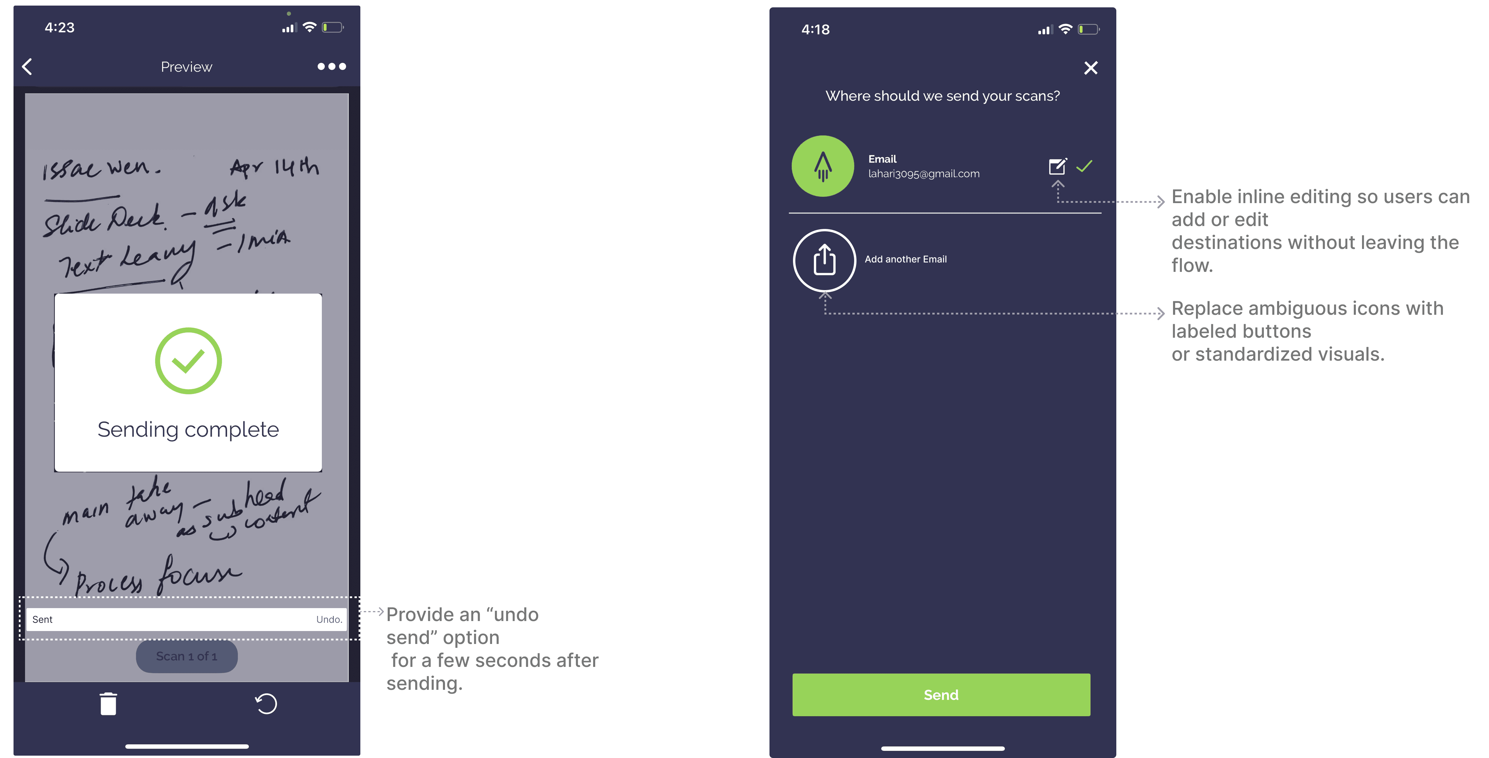
User's confidence dropped most when different icons pointed to the same email destination, breaking expectations: "No confirmation screen, no undo, no inline editing" (scan task), and satisfaction dipped in tasks where users had to "guess" (finding Help). Even when they succeeded, it didn't feel effortless because success was often followed by lingering doubt. "Did it work?" was the most repeated phrase.

Participant quotes illustrate this friction
"I thought I scanned it, but I can't see it anywhere."
"I didn't even know there was a Help section."
"The eraser at the back is a lot more time-consuming."
Behavioral
Users defaulted to Explore for help, revealing a labeling mismatch. Icons broke expectations. Freeplay showed total avoidance of advanced features.


Participant, after multiple unsuccessful attempts and checking with the moderator each time, she shows a faint, self-conscious smile.
INSIGHT
Early usability breaks traced to mismatches between design and user expectation
These breakdowns weren’t random instead they mapped to classic usability principle violations:
1. Scanning lacked safeguards
Users expected icons to mean different things, but multiple icons led to the same email destination. Without confirmation or undo, participants second-guessed whether scans were sent, undermining trust in the product’s core feature.


2. Erasing wasn’t clearly taught
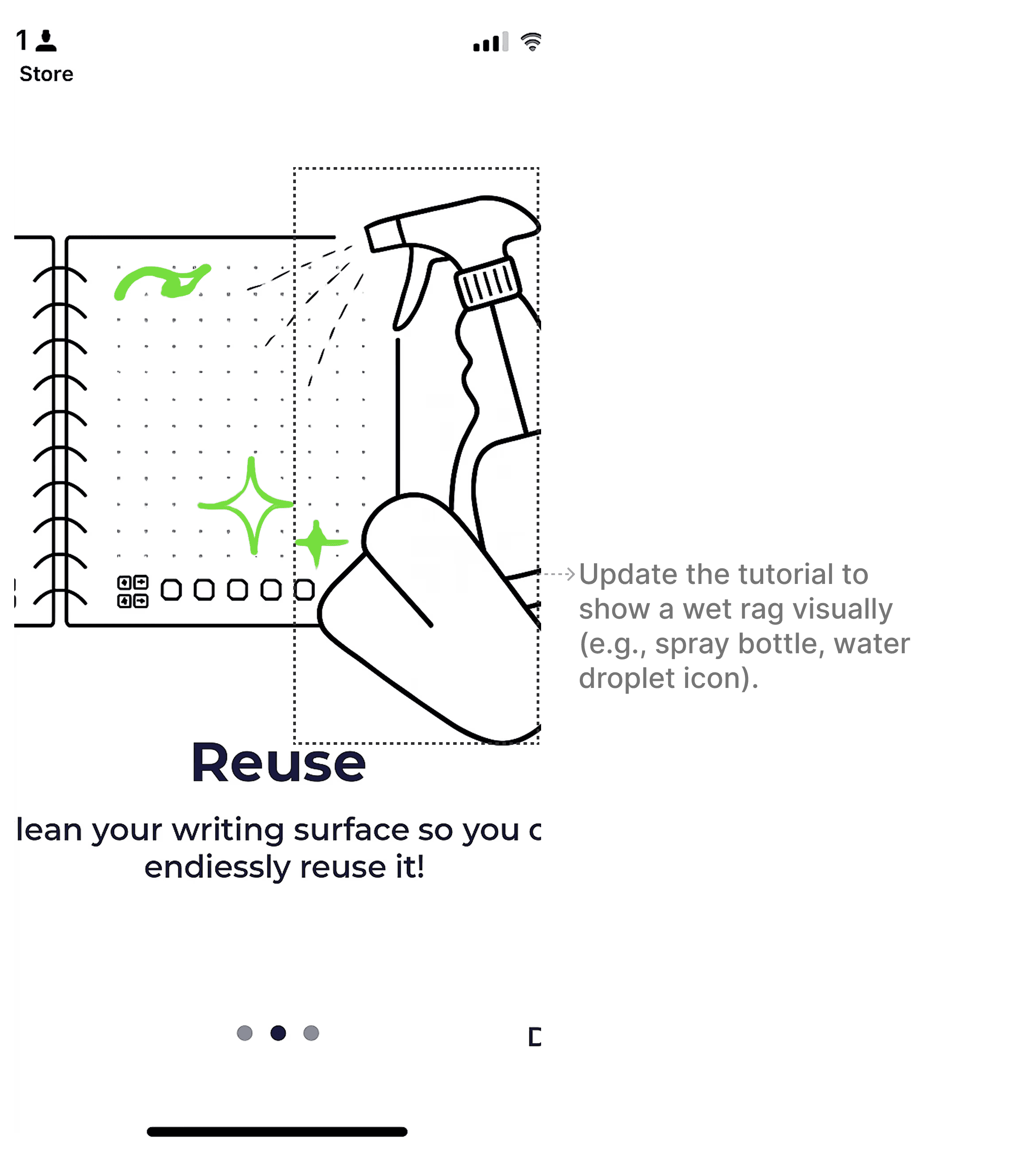
The tutorial showed a cloth, but did not say that it must be wet. Combined with a hidden pen eraser, this created unnecessary delays and confusion for first-time users.indicate
3. Onboarding once skipped was gone
Most participants skipped the tutorial, and with no way to revisit, context was permanently lost. Skipping didn’t just save time, it blocked access to critical instructions later.
4. Consistency gaps amplified confusion
Icons, labels, and article titles weren’t consistent. One participant mistook the “X” icon for a password toggle. Others doubted whether they reached the right page when the titles didn’t match between Explore and article views.correct
5. Help Center didn’t match mental models
Only 1/5 found it unassisted. Most tapped “Explore” or “How-To,” expecting that to be support. Labels and placement didn’t align with users' understanding of what “Help” should mean.
DESIGN OPPORTUNITIES
Contextual tips, visible scan confirmations, and surfaced help could transform uncertainty into flow
1. Scanning lacked safeguards → Add confirmation & inline editing
Before

After
2. Erasing wasn’t clearly taught → Improve graphical communication
Add a visual label on the pen’s eraser so it remains visible even with cap placement.
Before

After
3. Onboarding once skipped was gone → Make tutorials re-accessible
After

4. Help Center didn’t match mental models → Surface & Rename
After

5. Consistency gaps amplified confusion → Standardize labels & icons
Match article titles between Explore lists and their destination pages.
Avoid conceptual overlap (e.g., consolidate Help/How-To/Explore into distinct roles).
Before

After

IMPACT IF APPLIED
Small nudges deliver big gains: Task success could rise to 90% plus, with confidence and discoverability dramatically improved
The Overview consolidates what previously required 30 minutes checking multiple reports. Information is organized by task priority: recognition and alerts at the top, performance trends and queue in the middle, model status at the bottom.
80%
Help discovery (up from 20%)
2x
Scan Confidence
~90% plus
projected overall task success rate (up from ~60%)
REFLECTION
Usability testing isn’t about proving a product wrong, it’s about showing where it fails to support its users
This project underscored that usability testing is about surfacing mismatches between system design and user expectations. The Rocketbook Mini’s notebook worked fine, but the app broke trust by hiding support, skipping explanations, and failing to reassure users at key moments. Testing made those cracks visible.
